
Savr
Overview
Not everybody likes to cook. Using recipes alleviates some of the guesswork and confusion, but users are often led astray by unfamiliar ingredients, techniques, or equipment.
Savr is a mock startup that shows hundreds of recipes, and cooking tips for at-home chefs. Recently, Savr has seen negative feedback about recipes that involve many steps, or more advanced techniques. Many at-home chefs were excited about a certain recipe and ended up being disappointed with the outcome because they didn’t feel the instructions were clear, or easy to execute. At present, recipes in Savr are displayed as basic, text-based ordered lists. Our solution redesigns the Savr native mobile app to provide a better experience for at-home chefs when it’s actually time to cook.
This project was completed in one week as a mock design sprint.
My contribution
User Research Product Design
The team
1 x Product designer
Year
2023

Process
The Challenge
Compared to ordering take-out, the opportunity cost of cooking at home, especially when things don’t go according to plan, is quite high. Wasted time and ingredients, not to mention still being hungry, makes at-home cooking a daunting challenge for inexperienced cooks. Recipe apps, like Savr, provide user-curated and tested recipes, but often fall short in providing a positive user experience when it’s time to actually cook.
Users often express frustration about not knowing what certain ingredients are, not knowing how many pots and pans they’ll actually need, not knowing what certain techniques are, and not knowing what the timing should be for more complicated recipes. We want to encourage users to cook at home, and that requires a user experience that makes following and trying new recipes enjoyable and challenging, not stressful and chaotic.
Learning by Cooking: Understanding How Users Use Their Time in the Kitchen
.jpg)
The core audience for this product is users who already cook a 2-3 times a week, but often lack confidence in the kitchen or are pressed for time and lack the opportunity to experiment and try new things. The ages and occupations for our target audience are mainly the 25-40 age demographic, typically in the workforce along with having children or a partner.

Success in the Kitchen: Frustrations and Goals
User Stories
After speaking with our users to gain a better understanding of their pain points and desires, we created user stories to understand what exactly users will want to accomplish when using our platform. The user stories gave a clear vision on what our goals for this design must accomplish. Primary goals are presented in green, with secondary and tertiary goals in blue.

Sketches and Wireframes
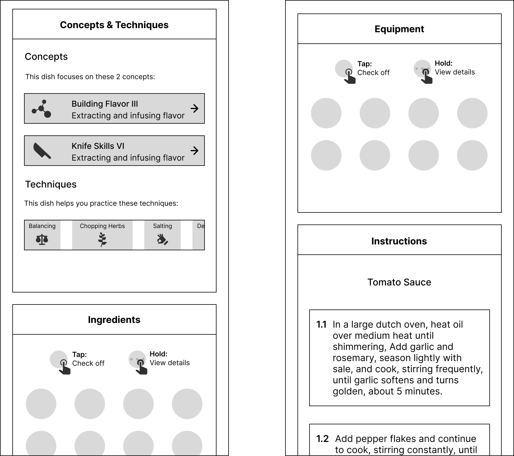
Based on the initial research and user stories, I moved forward with the wireframes. As the sole designer, I created all of the initial screens. Initially, the emphasis was on the actual recipe instructions, but looking at the user interview, a more holistic cooking and education solution was a better fit for our users.
After referring back to the user stories, I saw that users didn’t necessarily have problems following the actual recipe instructions, rather using new or unfamiliar techniques and ingredients created confusion and chaos in the kitchen. This sentiment was highlighted by the fact that multiple users would return to recipes they were already familiar with. To address this pain point, I sought to create a solution that prioritized user education, while still considering the user’s experience while actually cooking.

The next iteration follows with the idea that the recipe app should have a strong emphasis on the educational component. We also explored ideas for structuring the actual recipe instructions.
Testing and Redesign
After completing the initial wireframes, we conducted informal tests to evaluate the viability of the product and its design, as well as to collect feedback on visual design elements. This phase of testing yielded two key insights
- While in the act of cooking, users frequently expressed frustration at needing to refer back to the recipe, but losing their place in the instructions or not knowing what steps were part of what element of the dish.
- Users strongly preferred graphic, card-based layouts for viewing large amounts of information. Additionally, in line with the F-pattern for screen viewing, users tended to select the first option in the top-left of a screen, as they assumed the relevance of returned search results had already been sorted to match this format. Keeping this feedback in mind, we went back to the drawing board and created a new style and design guide, as well as new high fidelity screens.
Prototype
Outcome
Overall, this project was a good exercise in iterating over the course of one week in a design sprint. I was able to synthesize user research, identify user pain points and goals, create sketches that addressed these pain points and goals, and finally create high fidelity mockups that showcased the final solution. Given more time, I would've liked to expand more on the educational modules as well as refining the actual instructions flow. It seems that the instructions flow would be highly reliant on interactive design elements in order to present an adequate amount of information, while also maintaining a degree of simplicity to keep users focused on the task at hand.